Python – Heat Maps
A heatmap contains values representing various shades of the same colour for each value to be plotted. Usually the darker shades of the chart represent higher values than the lighter shade. For a very different value a completely different colour can also be used.
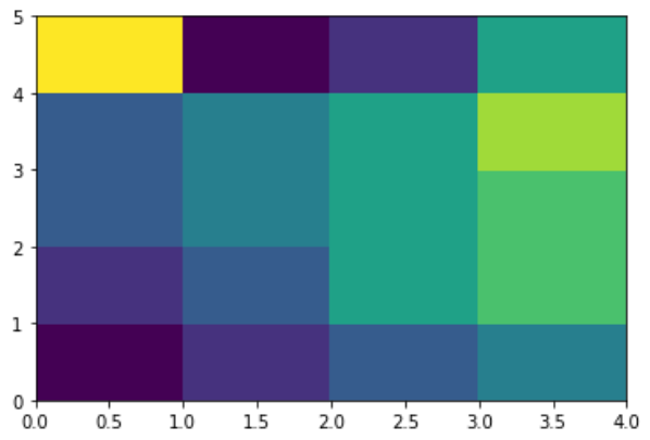
The below example is a two-dimensional plot of values which are mapped to the indices and columns of the chart.
from pandas import DataFrame
import matplotlib.pyplot as plt

data=[{2,3,4,1},{6,3,5,2},{6,3,5,4},{3,7,5,4},{2,8,1,5}]
Index= ['I1', 'I2','I3','I4','I5']
Cols = ['C1', 'C2', 'C3','C4']
df = DataFrame(data, index=Index, columns=Cols)

plt.pcolor(df)
plt.show()
Its output is as follows −